In the past on Particletree, we’ve shared some of our favorite resources and guides for helping the color challenged and uninspired get their chromatic deliciousness on. As a designer, getting to choose the colors is often the part of the job I like the best. However, there are times when it’s nice to be able to write some code to help make some of the decisions for you.
One of my favorite implementations of using programming to supplement the color picking process was done by the clever Canadians over at Dabble DB. All you have to do is upload your logo and their application will automatically pick the colors based on the information contained in the image and create a theme for their web app that will match the logo.

It’s an impressive feature that helps the user focus on getting things done rather than worry over the details. While I won’t be going into all of the ideas they used to implement their feature in this article, I do want to take some time to talk about how you can get a legible contrasting foreground color for a piece of text when given a specific background color.
When we were working on the Wufoo Form Gallery, I wanted a way to represent the pre-made color palette themes in a concise format without having to go through the laborious process of making a screenshot for each one. After a lot of trial and error, the following format is what we came up with for the gallery to represent themes:
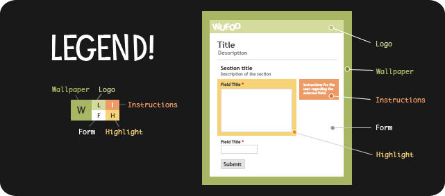
The problem that we ran into after coming up with a structure that we liked, was that the text inside each color swatch needed to have some sort of logic applied to it so that it would show legibly regardless of whether it was a dark swatch or a light swatch behind it. This is when we turned to color theory to help us out.
According to the W3C, when you’re evaluating your web site for accessibility, you should ensure that foreground and background color combinations provide sufficient contrast when viewed by someone having color deficits or when viewed on a black and white screen. How does one know if two colors will provide sufficient contrast? Well, the W3C, being the fastidious folks that they are, provide the following definition and formulas to make what seems subjective very quantifiable:
Two colors provide good color visibility if the brightness difference and the color difference between the two colors are greater than a set range.
Color brightness is determined by the following formula:
((Red value X 299) + (Green value X 587) + (Blue value X 114)) / 1000Color difference is determined by the following formula:
(max (Red 1, Red 2) - min (Red 1, Red 2)) + (max (Green 1, Green 2) - min (Green 1, Green 2)) + (max (Blue 1, Blue 2) - min (Blue 1, Blue 2))
And so, if you’ve got two colors and their color brightness difference is greater than 125 and the color difference is greater than 500, you’re in the clear. Unfortunately, the formulas are only a starting point. They can evaluate whether your colors are made to be together, but they can’t actually decide your colors. Thankfully, the Internet is filled with a number of wonderful people that have tackled the problem head on. One of our favorite solutions we looked at was created by Patrick Fitzgerald over at BarelyFitz Designs. His CSS Color Class allows you to refer to colors using abstract names like base and highlight, automatically generate color gradients from a single base color and also adjust the contrast of foreground colors so they can be legibly seen on top of background colors.
While the CSS Colors Class is great and comes highly recommended by us (we’ve been able to do some pretty neat experimental stuff with it that we’ll hopefully use in the future), we thought for our purposes in the gallery, it was a bit too much overhead. Eventually, we ended up creating our own Smarty Modifier plugin based on code we found in the PHP documentation on the hexdec function—boy, do we love that community. Here’s the code we came up with, which can be easily be rewritten if you don’t use Smarty in your development environment.
function smarty_modifier_contrast($hexcolor, $dark = '#000000', $light = '#FFFFFF')
{
    return (hexdec($hexcolor) > 0xffffff/2) ? $dark : $light;
}
It’s very simple and very lightweight, which was exactly what we were looking for in a solution for the problem. The way the code works is that given a hex color like #FFFFFF or #CCCCCC, it will return either the hex for black or white depending on what’s appropriate. You can also pass in variables for $dark and $light in case you want the function to return colors other than black and white. In our Smarty template, we call it in our markup structure like so:
<span class="palette">
    <var class="w" style="background-color:{$bgHtmlColor};
        color:{$bgHtmlColor|contrast}">W</var>
    <var class="l" style="background-color:{$bgLogoColor};
        color:{$bgLogoColor|contrast}">L</var>
    <var class="i" style="background:{$bgInstructColor};
        color:{$ftInstructColor}">I</var>
    <var class="f" style="background:{$bgFormColor};
        color:{$ftFieldTitleColor}">F</var>
    <var class="h" style="background:{$bgHighlightColor};
        color:{$ftFieldTitleColor}">H</var>
</span>
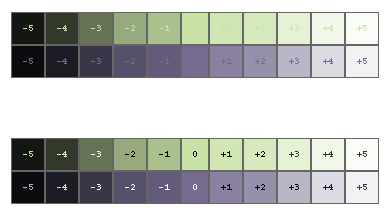
Notice that the code doesn’t take those color difference and color brightness formulas into account. Basically, it crudely (yet kind of elegantly) divides the RGB color spectrum into two halves and if the color you give it is on one side, it returns one value, otherwise, the other. Here’s a very rough visual approximation I mocked up to illustrate the concept:

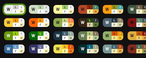
And so while it’s not perfect, in 99% of cases, the function does what you need it to do without a lot of number crunching or programming overhead. Here’s an image showing off the function in action on a number of the themes we created in the gallery.
We’ve even recently reused the functionality when we made some upgrades to our graphing system in Wufoo. Now, our graphs automatically determine and use the appropriate color for the grid lines based on the background color a user has selected from their themes.

This way, the graphs are easy to read and follow even on a dark theme palette. It’s a small detail that we think makes a lot of difference in an application. If you want perfect contrast, then obviously CSS Colors is the way to go for you, but for us we’ve been really happy with the results.


This is really cool, and potentially very, very useful. Thanks a lot!
Awesome article. Thank you!
Great Article!
This is really very useful. Great insights into your color scheme.
Very insightful and very usable. If only the folks from Monster.com would take a look at this and change their terrible and nearly illegible “orange-font-on-green-background” HTML e-mail notifications. Keep up the good work.
Great Article!!!
Wow thats useful, thanks :)
Reducing design decisions to algorithms makes me very happy
Nice one. Thanks ;)
Nice tool and article! Sounds like a perfect topic for SXSW.
Particle Tree is one of FEW websites these days that seems to understand and care about legibility and accessibility, by not having an iota of light grey text. And Wufoo rules too, for that very reason as well as your experience and functionality of course.
What is this mindless trend that only seems to get worse? Witness http://www.addit.com, the worst offender I believe. Even design leaders like Apple - who cater to a mass consumer audience - have fallen prey to the delightfully disappearing text act.
Do you feel this is a trend like wearing baggy pants that fall down or something that’s here to stay?
And do you feel it’s a dirty secret - as I do - that the people who run the sites hate their light grey text as much as their customers, but feel it’s necessary to appear au currant by having “elegant” light grey text?
THANK YOU FOR BEING REAL and bucking this trend.
oops I meant http://www.addthis.com/
Des Traynor wrote an article on color brightness. He gives similar formulas for calculating the difference between two colors. We implemented his calculations on http://www.cedarcreeksoftware.com/brightness-calculator.html.