Introduction
Creating a consistent interface for your users is a constant struggle for every application designer. Building consistency on the web is especially tough because the visual rendering differences across browsers and operating systems are wildly different and almost arbitrary in what can and cannot be done. No where does this become more apparent than when you’re dealing with form elements and the biggest loser of them all in the battle for a standardized look is the infamous Submit button.

As is, the input with the type=”submit” is either too ugly (Firefox), a little buggy (Internet Explorer) or completely inflexible (Safari). The solution for most is to use image inputs and create the damn things ourselves. And it’s unfortunate, because then we’re reduced to the tedious tasks of opening up Photoshop every time we’re in need of a new button. What we need is something better—something more flexible and meant for designers. Lucky for us, the solution already exists and all it needs is a little love. My friends, let me introduce you to my little friend : the <button> element.
Inputs vs Buttons
So, here’s your standard submit button markup:
<input type="submit" value="Submit" />
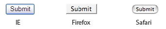
And it looks like this across the three brothers:
Meh. Here’s the markup used when creating a button element that submits:
<button type="submit">Submit</button>
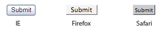
And it looks like this :
These buttons work and behave in exactly the same way as our counterparts above. In addition to submitting the form, you can make them disabled, add an accesskey or even specify a tabindex. Aside from the visual indifference Safari seems to have for them (it doesn’t put that forced aqua interface on it, which we’ll be able to use to our advantage), the coolest thing about the <button> tag is that you can put useful HTML elements inside them, like images:
<button type="submit"><img src="" alt="" /> Submit</button>
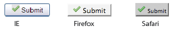
Which looks like this :
Nice. (Okay, they’re a little fugly, but I said they’re in need of a little love.) In fact, according to the W3C these special visual differences is exactly why the <button> elements were created.
Buttons created with the BUTTON element function just like buttons created with the INPUT element, but they offer richer rendering possibilities: the BUTTON element may have content. For example, a BUTTON element that contains an image functions like and may resemble an INPUT element whose type is set to “image”, but the BUTTON element type allows content.
And so here we were looking for a design solution and here our friends writing the giant handbook of the Internet had a piece of markup meant to help us with just such a problem. Convenient, yet unfortunate that most designers and developers don’t even know the element exists. Now, before I made the jump to replace all the image inputs in Wufoo with button elements, I decided that the markup and CSS would have to fulfill a couple of requirements.
The Requirements
They had to look like buttons.
They had to look the same across browsers.
The styles I used for
buttonneeded to also be used with ones I might use with links (since interaction in Wufoo is always initiated with either a Form Submission or an Ajax Call from a link, these things probably sit next to each other and I needed them to have the same visual weight).The markup needed to be flexible and easy to change for uses in lots of different situations.
I should be able to use icons and colors effectively to pass information about the kind of interaction that would be taking place.
With those challenges in place, I dove into the CSS and after solving some cross browser challenges, came up with the following (which you can also see all over Wufoo):
The Results
 Change Password
 Cancel
Nothing crazy. Simple, but effective. Now, what I love about this way of handling buttons is that I can use the 1000 icon arsenal from FAMFAMFAM to illustrate a ridiculous number of ideas and actions without having to generate something from Photoshop every single time I need something new. If we take a quick look at the markup, you’ll notice that the last two buttons up there are actually links:
<div class="buttons">
    <button type="submit" class="positive">
        <img src="/images/icons/tick.png" alt=""/>
        Save
    </button>    <a href="/password/reset/">
        <img src="/images/icons/textfield_key.png" alt=""/>
        Change Password
    </a>    <a href="#" class="negative">
        <img src="/images/icons/cross.png" alt=""/>
        Cancel
    </a>
</div>
The reason this is useful is because lots of actions in web applications are REST driven and so simply sending a user via a link to a specific URL will initiate something they need to do. Using styles that can work for both types of elements (links and buttons), gives us the flexibility to keep our means of interaction looking consistent and appropriate whether it’s being done with Ajax or a standard submission.
Just a quick aside, you may wonder why I’ve left the alt tags blank in those icon images. It may come as a surprise to some that while alt attributes are required on every image, actually describing them is not. Empty alt attributes are completely valid and help screenreaders know which information to effectively ignore, saving your users precious time when they’re trying to find the next appropriate actionable item. Because the icons are actually superfluous, I’d rather not waste the user’s time hearing about the image I used to visualize what’s going on. They’ll just hear “Submit” rather than “Checkmark Submit”, which would actually make things a little confusing.
The CSS
For the most part, the CSS for styling these buttons are fairly straight forward. The hair-pulling inconsistencies across browsers results in the number of padding discrepancies below, but it’s nothing impossible and lucky for you, already figured out.
/* BUTTONS */.buttons a, .buttons button{
    display:block;
    float:left;
    margin:0 7px 0 0;
    background-color:#f5f5f5;
    border:1px solid #dedede;
    border-top:1px solid #eee;
    border-left:1px solid #eee;    font-family:"Lucida Grande", Tahoma, Arial, Verdana, sans-serif;
    font-size:100%;
    line-height:130%;
    text-decoration:none;
    font-weight:bold;
    color:#565656;
    cursor:pointer;
    padding:5px 10px 6px 7px; /* Links */
}
.buttons button{
    width:auto;
    overflow:visible;
    padding:4px 10px 3px 7px; /* IE6 */
}
.buttons button[type]{
    padding:5px 10px 5px 7px; /* Firefox */
    line-height:17px; /* Safari */
}
*:first-child+html button[type]{
    padding:4px 10px 3px 7px; /* IE7 */
}
.buttons button img, .buttons a img{
    margin:0 3px -3px 0 !important;
    padding:0;
    border:none;
    width:16px;
    height:16px;
}
One thing that came up while working on this was the fact that there’s a rendering bug in Internet Explorer in regards to showing long buttons. You can read about it at Jehiah.cz, but it’s what’s responsible for some of the width and overflow declarations above.
Adding Some Color
In Wufoo, we made the hover color blue for neutral actions and used green and red appropriately for positive and negative connotations. The following are the styles we’ve created for dealing with buttons that are meant to show positive interactions like adding and saving and negative interactions like canceling and deleting. It’s a nice touch for us and obviously you can pick and choose to your liking.
/* STANDARD */button:hover, .buttons a:hover{
    background-color:#dff4ff;
    border:1px solid #c2e1ef;
    color:#336699;
}
.buttons a:active{
    background-color:#6299c5;
    border:1px solid #6299c5;
    color:#fff;
}/* POSITIVE */button.positive, .buttons a.positive{
    color:#529214;
}
.buttons a.positive:hover, button.positive:hover{
    background-color:#E6EFC2;
    border:1px solid #C6D880;
    color:#529214;
}
.buttons a.positive:active{
    background-color:#529214;
    border:1px solid #529214;
    color:#fff;
}/* NEGATIVE */.buttons a.negative, button.negative{
    color:#d12f19;
}
.buttons a.negative:hover, button.negative:hover{
    background:#fbe3e4;
    border:1px solid #fbc2c4;
    color:#d12f19;
}
.buttons a.negative:active{
    background-color:#d12f19;
    border:1px solid #d12f19;
    color:#fff;
}
Conclusion
In the end, this is just how we’ve decided to handle things with Wufoo and it’s worked out wonderfully for us in regards to our development workflow. Of course, this isn’t the only way to play the game. There’s lots of ways you can spice this up (use gradients!) and change things around (use image replacements over images in the markup). Because the <button> tag can handle nearly any kind of markup inside there, you can add some <span> tags and use Alex Griffioen’s recently written method on creating really beautiful rounded gradient creations. Honestly, I’m hoping this is just a great starting point for a lot of designers struggling with reusable form interfaces in their applications. If anything, I hope you take another look at this often wasted form element and think twice before reaching for that input and PSD for submission.


Great write up on the button. I’m switching right now!
good post !
great technique !
Beautiful stuff, I’ll be stealing that technique for something I’m working on at the moment.
I believe there is a small issue for using the button tag in IE: if you count on the value being passed along when a button is clicked to determine an action (e.g., save v. change password v. cancel in the example above), you may be up a creek: http://www.peterbe.com/plog/button-tag-in-IE
Maybe there is a better way to handle multiple buttons, but I actually look for the name of the button that was selected in the POST data. It will work fine if you only have one button (or, I guess, many buttons that do the same thing, as in one application I saw once :)).
Hey Rob, I do remember reading that while doing the research on this. Honestly, it’s a non issue for us because there’s only ever one button that submits a form on our web application. The other buttons are always links and so that’s the method we use.
It’s hard, also, for me to come up with multiple reasons why you might need multiple button inputs on a form. If anyone could provide some useful examples, I’d much appreciate it.
Yeah, this IE issue was a huge pain in the butt for me once. I discovered that buttons were easier to style using this technique over a year ago, recommended it to my boss, and then implemented them in a web application. When our client couldn’t get it to work on IE, it took quite a while to figure out the bug. I’ve never used them again since, but perhaps there is a better way to handle multiple button actions.
Great article about an element I always forget. Thanks!
I like how you guys put the code in black!
Since I’ve been using this tag, my forms can look smarter, ‘cause I can use “text-indent” to doesn’t display text inside buttons, using a image on background for it.
On IE it works only with button tag.
You chaps are true heroes of the interwebs.
In my opinion, the biggest loser of them all is the infamous file input button.
PS. I never noticed it before, but here it goes: are you guys aware that the label for comment textbox says You may use HTML for style?
Kevin, one example of multiple buttons is one that I get from numerous clients: OK and Cancel. Personally, I understand the one-button-plus-links convention, but my clients aren’t exactly fond of this for two reasons: it doesn’t look nice and they’re used to the conventions of desktop software.
Mislav — Ah yes, the dreaded file input field! Just the mere mention of it makes my blood boil! Grrr!!!
Just wanted to point out that there are issues with this - in IE7 save button active states don’t work, the button is taller than the links, and it has a black border all round it.
In firefox 2 the save button is slightly taller than the links.
I’m using Vista.
Francis, this is why we implement the styles in a way that makes them look identical. We use Save and Cancel all the time in mixed button/link format and the stylings shown here keep them from looking awful.
Kevin, I like this approach! Any way to get around the weird solid border around the button in IE6 though — besides upgrading :P?
As mentioned by a few, the button element is the coolest ever!, and the worst implemented on IE.
Issues: 1.) IE submits the .innerHTML as the value, not the value attribute 2.) If you put an animated GIF, as your image, IE doesn’t render the transparency properly, at all… turns the face of the button white 3.) If you want the button to do something, but not submit, you need to play some games (Firefox vs. IE) 4.) They render horribly in IE, if the text is long, and you haven’t hacked your CSS to accomodate 5.) Any “button” elements not clicked, are not submitted as part of the form (just something to keep in mind) 6.) IE handles the default padding/margin differently, for input vs. button when hover/click events occur (need to tweak CSS) 7.) Generating button elements in IE, via DOM calls can cause issues (rare, but be warned)
Also I’m not sure if this is relevant (haven’t tested), but Auto-Complete in IE (the storage of previously typed data), does not work with input:type=button fileds, it has to be input:type=submit. I would hope that the button element behaves the same as the submit, but if it doesn’t, then auto-completion will be broken. (need to test, to verify this)
Addition… the button element does store the values for auto-complete in IE (good news)
Now if only they would fix the someForm.submit(); to work ;-)
A nicely written article. I think the only point I’d add is that it would be better if you made the icons background images to the button and anchor elements and applied with a suitable class (which you already have in two cases anyway). That way you’re not adding additional markup for what is essentially a presentational effect.
In my experience in building XHTML/CSS UI for developers that they have major issues when they use the element in IE as others have. Therefore, I have resorted to wrapping buttons in a
<
div>, which should allow enough of a hook to re-create the same styling effects demonstrated here.
looks great in firefox 2, but save buttom are not working in IE6 ( border , and hover properties)
Uhhh, even though I’m a Firefox user, what about adding Opera to that review, I’m sure there’s still a lot of people that browse the web with it!
Everyone needs a hug.
The top half is cut off in Opera (until you hover over them).
Not to be harsh, but whenever i see a cross-browser CSS guide of any kind, and it doesn’t work in Opera… I get sad. Why does everyone ignore us Opera users? =P
Salman, which version of Opera are you using, it looks fine in 9.20. I agree it’s difficult to create a CSS that suits every browser. And Opera is always different from the rest.
Anyway, great write-up.
By far the coolest looking comment section i’ve ever seen
Everyone needs a hug. Hey thanks for the code demo. This is a very useful piece of info.
Could you not do the exact same thing by setting a class with the required styles?
.save { … }
The reason that I ask is that a lot of frameworks render out something out of your control, ex ROR, ASP.NET, so the ability to use the button element isn’t there.
Why fake it, when you can just deploy a Java Swing application with webstart? There is even a plugin in Maven 2 that makes the whole process trivial.
One JNLP url = escape from browser incompatibility hell.
BTW, Love your “Submit Comment” button ;)
Never even knew that a button could be customized so heavily! Cool write-up man!
Nice work!
oh, and, uh, Everyone needs a hug…
very good ! thanks !
I guess I’d be the one critic of this technically sound feat in saying “Why”? What are you giving the user with the addition of an icon in a button control? Of the three, Save, Change Password, and Cancel, the Cancel extra emphasis seems possibly helpful though I would imagine OK/Cancel is well understood by letting the OS render the control & state. Change password graphic is ambiguous. Save graphic is not helpful visually in the least.
Not a fan of MSFT, but I’d side with them on the usability/reasoning on this technique: http://msdn2.microsoft.com/en-us/library/aa511453.aspx “Avoid combining text labels and graphics on command buttons. Combining text and graphics usually adds unnecessary visual clutter and does not improve the user’s comprehension. Consider combining text and graphics only when the graphic aids in comprehension, such as when it is a standard symbol for the command or it helps users visualize the results of the command. Otherwise, prefer text, but use either text or graphics.”
Great work, will definitely be using this in the future.
Great article. I’ve reading this site for 6-7 months now. Did you guys stop writing the e-book / e-articles? Get them going again! Great stuff, once again.
The end here is excellent and I love the way the buttons come out visually. Say what you will about useless icons consfusing users etc etc… in almost every real world case I find that, when standardized in an application, icons + text serve as a visial reinforcement to the user which ends up helping them use the application more quickly and accurately.
With that said, the way IE handles the button element is outlandish. Especially when you’re talking about returned variables. This has caused more ambiguous bug hunting than I care to remember.
I don’t discourage using the button element but make SURE you familiarize yourself with how IE will toss your variables to you. If you can’t make the button “name” and “value” attributes identical (there might be a number of good reasons why you wouldn’t?) then your backend code may actually have to handle multiple cases depending on the browser… that gets uselessly dirty.
Thanks for reminding us of this long forgotten element. I agree with Ed Eliot though on the fact that you’d better include the icons in your stylesheet rather than using images. It makes your markup look less cluttered.
Great article, more interested in the great way that you display your comments. When it comes down to it, the whole site is really nice. Great job :)
This is the worst layout for a “comments” section that I have ever seen. Why, since we’re talking about usability, are there two columns?!
Why not mention more of the downsides in the article?
PS> Very confusing to see the comments in this layout. I much prefer just one column ordered by date
Genius ! never knew that button can be used that way. I’m switching now. Thanks for the information
This is great, thanks a million for the article. I have been writing a ASP application for work and have been trying to implement some sort of buttons, but have been stuck with the boring original styled ones, now I can use great hover effects and standardise the look and feel.
Fantastic - thanks for the great write up!
Absolutely adoreable!
Nice article. I recently ran into some problems using multiple buttons for form submission in Internet Explorer (6). I combined some tips from other sources into a solution which works nicely. I put some info on this up at: http://www.kopz.org/public/documents/css/multiple_buttons_ie_workaround.html Hope this is useful for anyone running into the same problem.
Finally an article on the
<button>element, IMO one of the most overlooked html element. It is far easier to style and behaves exactly as you’d expect it too (heh, as a button).I wasn’t aware of the problems with IE, haven’t ran unto the problem yet. Keeping the value the same as the inner value probably “solves” that.
Good article, and a classy solution on the Wufoo buttons! :)
Great article, I’ve been using a similar technique to style buttons and links alike.
But I would advise on setting the images in your stylesheet as background-image instead of wrapping them in the a and button tags.
simple and straight to the point
Great - thanks for the guide.
Everyone needs a hug. Great write up!
Great article, always learning something new ;)
I really dig your comment style.
This is a great article, I’ve never actually used a button instead of input.
I really liked the “The Results”! I shall use them on my personal blog!
Great article as always Kevin. I’ll agree with a few other commenters though, your comment layout gives me a headache. Blehhch….
You’ve gotten a lot of praise on this, so I’m going to criticize :-)
The button element does afford you consistency across browsers, but is cross-browser visual consistency really that important for a form submit? How many people are using multiple browsers per session to view a site and would benefit from that consistency?
I’ll argue that it’s more important that a button on a web page look like a button in a rich-client app in my OS. The reason Safari uses Aqua styling of submit input elements is because almost every other button in OS X does too. So the “Gather Windows” button in my Display preferences looks exactly like your “Submit Comment” button at the bottom of this page, and I can safely expect similar behavior from both of them. I can’t speak for Windows/IE on that topic.
Great article — this is something I’ll definitely look into utilizing from now on.
However, it doesn’t seem to adhere to any Javascript that’s attached to it, unlike the tried and true input button. So unless someone can steer me in the right direction with that regard, I’ll just stick to applying to more “traditional” forms.
I’ve done this on a few occasions in the past, but had totally forgotten about it. Thanks for the refresher!
Just chimming in to further help your site - Very Cool buttons, but doesnt look right in IE 6 - needs a green border on the SAVE button. This two column comment system is weird. Just my $0.02 :)
Ok. But what I really want to know is how I can change other form elements as well. The drop-down menu arrow, the radio button, etc… Any thoughts anyone?
ps. I like to use an image to replace the button entirely. Much easier, and cross browser compatible. Only problem would be if anyone has images disabled. They will only get the submit link. But I think that is actually much better. markup would be something like:
works perfectly in IE6 and 7, FF and Safari.
oops. Markup didn’t show up, guess I have to encode it. Let’s try again.
<div class=’FormButtons’ style=’margin-bottom: 1.5in; clear: both;’> <input type=’image’ value=’Submit’ src=’/images/btn_submit.gif’> </div>
What a pain in the ass for a couple buttons!
Everyone needs a hug.
I will say that though a great idea… it sounds like its another one broken by ie’s programmers.
That in mind, I still be playing with this some, thanks for the writeup.
bravo!
Unfortunately, the button element doesn’t work in IE on Windows CE and Pocket PC devices. It will render but you cannot activate it. I ran across this problem creating an accessible web app that was going to be used exclusively by blind users. Many of their PDA and Braille Notetaker devices run on the Windows CE and Pocket PC devices. I originally used button elements until it was discovered that they could not be activated on these devices.
Also, instead of using img tags inside of the button element, you might want to designate a left aligned background image and pad the button on the left to accommodate for it using CSS. Visually this has the same effect but screen reader users don’t have to listen to the announcement of yet another meaningless image. This provides further separation of content and presentation so you can update the image site wide by altering your CSS instead of replacing img reference throughout your site.
It’s tempting to use the button element since at first sight it seems to solve all your customization needs. But it comes at a price as there are a lot of problems with the button implementation in browsers especially in IE. See my quick-summary at http://radaschuetz.com/archive/2007/04/21/button-hell/ There’s a reason why this element was almost forgotten, and only rarely gets “rediscovered” …
I’ve got to say I’m disappointed.
Buttons that look like OS-generated buttons (or ‘fugly’ as you call them) have the advantage that whoever runs them on whatever platform, they’ll look like a button. The last buttons don’t look like buttons to me.
I mean don’t get me wrong, It’s good code and some real neat tricks, I’m not trying to take that away from you. I’m just not sure that you’re getting a more usable site out of it.
I have to agree with Rob. One of the things you want to do for usability is keep things that the user has learned to identify simple and untouched, and I believe buttons are a part of that.
The nice part is that the same look can be applied to links. Every item in your site that performs an action can have the same look. This helps users understand whats going on more than a half button / half link setup does. So while you lose the platform styling, you still gain a different usability benefit.
This comments page just made me really happy because it’s so colorful and I felt compelled to say something. goodbye!
Everyone is a bug.
Everyone has a rug.
Excellent job Kevin! I hadn’t even thought of using the much more appropriate button tag for my tutorial, although I’m sure it could achieve the same effect. Great!
Great article. One gripe I have with people overriding the style of buttons is that the visuals during interaction get messed up. If you click the button, it doesn’t “sink down.” That’s a big cue, for me, that separates blocky-looking links from buttons.
In your example above, visually something happens when I click down on the links, but nothing happens when I click down on the save button.
One of the best articles I’ve seen from you so far. Thanks for this and keep up the good work.
I think it’s hillarious that your “Submit Comment” button is generic as well
These are beautiful buttons
Excellent Stuff
Thanks, this is a great tutorial. :)
Man I love some of the stuff you guys write but I have to say this is really not a useful as you make it out to be.
Button elements have a lot of drawbacks as well as benefits, particularly browser inconsistencies, and to make matters worse Vista doesn’t seem to like them at all, meaning differences between XP IE and Vista IE has just become more apparent.
Apart from that, the layout of this comment section is without a doubt the hardest comment section I have ever tried to read… I gave up about 10 comments in because I lost my place, by all means don’t change it for me but maybe give readers an option (toggle) to change the layout to something easier to read. I ended up disableing styles just to make the comment easy to read… You can’t claim to be helping usability with comments laid out like this.
Why not use this technique for the submit comment button on this page!? Eh!?
I love learning new techniques. This technique can make buttons way more usable. Thanks!
Just to expand on the above comment about problems with WindowsCE/PocketPC - it’s not just those devices, but all mobile browsers that conform to the XHTML-MP (mobile profile) standard because (presumably) it’s based on XHTML-Basic, which doesn’t include the button element. I tested this on a couple phones I have and sure enough, the button elements aren’t even displayed.
Great article, but beware if you want to create forms that can be used on a modern mobile phone without munging.
-Russ
hi there excelent article i gonna used.. and the best was the link of the incons.. really good stuff for simply nice desing
Everyone needs a hug.
First, great article!
Is there anyway to make these a little smaller? Mainly speaking of height since they are pretty large buttons that don’t seem to mesh with my current forms. That said, I have messed with the CSS and can’t seem to figure out if this is a padding issue, line height, etc. Anyone messed with the sizing??
Thanks again!
I have quit using the “submit” input since I use Ajax. Thanks a lot for the tip !
Nice, thanks. This’ll be useful even just for the consistency between buttons and links.
The button tag is so poorly and inconsistently supported from IE 5 to mobile platforms that it is pointless to try to use it at all. It should go away.
Safari will soon support the styling of the input type submit.
Excellent! Web Design Usability For Forms is a vastly ignored area of web design.
Good form. Thanks!
great post, thanks
Reading the zigzagging comments made me dizzy and give up finishing everything :P Useful info though!
Have you heard about the HTTP methods GET and POST? Have you heard that clicking on a link triggers a GET, and clicking on a plain old submit button triggers a POST? Have you heard that GETs should not have side effects, so that users can click on them and refresh them with impunity without accidentally buying anything?
Please, at least learn why things are as they are before you start redesigning them.
Really? Roman says that if you have multiple <button>s in your form, Internet Explorer will include the values of each of them in its form submission data, so you can’t tell which one was clicked.
http://radaschuetz.com/archive/2007/04/21/button-hell/
I should test this myself, but it sounds like a nasty little issue.
Tried the button element, but dropped it. Too buggy in IE visually and behaviourwise, a pain to work around, just see the massive amount of CSS browser-specials needed in the article. This is just asking to break on some browser upgrade.
It is simply not worth it IMHO.
I also lean towards to the camp that leaves controls the way the OS renders them. I believe the instant recognision and understanding by the user what an input element does out-weights the visual consistency argument. Therefore, I leave input boxes, scrollbars, check boxes, radios and buttons as they are.
The only exception I make is a select box that needs richly styled options. And even there, I leave the select box as is and capture its activation to overlay the display.
Damn you. I saw this article, used everywhere in my code, and now, I have noticed IE doesn’t handle them (yea, just now, because I don’t have IE). So, damn you. Use your brain before writing this kind of articles. Eg. use Google to find feedbacks, you would have quickly seen that recommending them was a HUGE mistake.
Now I ban “particletree.com” from good websites list, because you really do suck.
I forgot: The red hover on “negative” links is a neat idea. I have to give this a try.
CSS saves the buttons’ layout. Thanks for the code!
Great article. I’ll definitely use the techniques here in upcoming web development projects. Thanks!
Thanks for sharing your form… I don’t even know when I last used the button tag, but I think it’s worth :)
Yeah, these don’t really work in IE 6…
Cool stuff, new things to learn, but I have a question, however: why in the world are you using <button> ? The same effect can be accomplished by using the traditional <input /> element and giving it some style in the exact same manner. If you compare the cons of the two elements you get to something like: Input: - no :hover, :active, :focus in IE - black border on :active in Opera 9.20 Button: - no :hover, :active, :focus in IE - no :active in Firefox (not in my 2.0.0.3) - submission problems when more than one buttons Ah, and the icon… since it’s only a visual enhancement, why don’t you place it in the background ?
One for Preview / Submit, Save / Send, etc.
Forgot a "One for" in the comment, sorry :-?
Great post. The final buttons are perfect. Thanks for taking the time to discuss so comprehensively.
Works great In FF, sucks ass in IE
Great - thanks for the guide. >vIrAn<
I’d thought I’d chip in with the fact that the Button element doesn’t work AT ALL in Netscape 4.
So if you’re serious about backwards compatibility you’ll avoid the little buggers…
Number 98 is correct…
With multiple buttons, IE cannot tell which button was clicked as it passes all buttons’ data. We ran into this problem while building Disney’s new Internet Booking Client, responsible for all of Disneyworld’s online booking. It became a major snag for us, but we have since resolved it.
Other than that, great article and great looking buttons
Nice writeup - we’ve been using the button element for a little while at my shop and both programmer and design have been really happy with the results.
I’m diggin’ the way you guys have done comments too - nice breath of fresh air.
In regards to not working on Opera… it does work in 9.2 on Windows for me. Works fine in IE 7 as well.
Please correct me if I’m wrong but it doesn’t seem like the CSS is setup to handle disabled buttons.
Can anyone confirm this? Better yet, does anyone have a good looking solution for handling disabled buttons in conjunction with this article?
Amazing!! i need this tutorial a long time ago, this is clean and easy to use, thanks for sharing your discover, cheers!!!
Great article. Here’s a followup technique that incorporates sliding doors with the button element. http://www.filamentgroup.com/lab/buttonElement/
Yet another example of something that looks class in FF, only for you to open it in IE and to be put off entirely… I could maybe live with IE users visiting to see that black line around the buttons, hell they deserve it, but the extra problems in processing form data makes it hardly worth the effort. Damn you IE.
Great article Kevin. Once IE is banned for the good of us all this will go global… methinks.
Everyone heeds a nug.
Everyone drinks a mug.
Great technique! I got quite far along using it to create “Continue” and “Start over” buttons for a form I’m developing, until I hit a serious roadblock, albeit not a CSS-related one:
Some browsers (IE 6, at least) seem to report the value of the button only when it’s pressed; others report it along with the rest of the $_POST data, regardless of whether or not it’s pressed.
For my application, that makes the tag unusable!
Am I doing something wrong?
Looks great and I like the fact that it’s completely CSS based.
@Graig Bailey (119): Yes, Internet Explorer will only POST the value if the button (or submit) is pressed. Therefore, you should never trust on a button to check whether the current request is a POST request. Considering you’re talking about $_POST, I reckon you use PHP. Checking if $_SERVER[‘REQUEST_METHOD’] == ‘POST’ is the way you want to handle this.
These hardly work right at all in IE6
Very well written, i’m sure this will save me a lot of time in the future.
“Convenient, yet unfortunate that most designers and developers don’t even know the element exists.” … funny that, for years i didn’t know input[@type=submit] existed and thought button was the only option!
Sucky, doesn’t works with lynx you’re out
i’m curently using php,
View Invoice #
(Enter an existing invoice number.)
, does IE POST the value„ even if
<
form method=get>?
I’m currently using PHP [form action=”ViewInvoice.php” method=”get” enctype=”application/x-www-form-urlencoded”] [div class=”buttons”] [p] [button type=”submit” class=”positive”][img src=”/images/icons/tick.png” alt=”“/]View Invoice #[/button] [input type=”text” name=”invoicenum” /] [/p] p[/p] [/div] [/form]
does IE make the button POST the value even if [form method=get]?
Everyone feeds a rug.
Everyone heeds a pug.
hmmmm, worth a try, i read all the articles and also comments, although it may have some drawback, i still wanna try it :-)
As I pointed out before, Alex Griffioen’s method/Sliding Doors will not work properly for the button-element, as Firefox needs some strange offsets to display those background images correctly :-( http://www.blogpotato.de/2007/05/04/das-button-dilemma/ (german only, try Google’s fancy translation tool if you are not familiar with the german language)
I use buttons with text-indent set to -3000px and a background image, which renders as normal button without CSS and a clickable image otherwise. This almost works cross-platform - except Safari 1.2, which doesn’t implement the negative text-indent. I use a little Javascript which removes the text of all button nodes for Safari browsers lower than 2 - a hack, but it keeps the CSS clean.
Nice, but still inconsistent. Comment style is innovative, but horrible. I hate the two column layout and the fact that some comments are out of order. VERY UNUSABLE.
I’m glad others are discovering the beauty of the
BUTTON.hi man, great tips, i’ve used it on my site (software copy protection) :)
From the HTML 4.0 Specification:
I assume this means to validate, this emelemt behaves like a textarea rather than an input. I cannot use this button implementation with IE because it assumes the <img src=… is the value of the form data.
Am I mistaken here???
Eric, the specifications say you can’t use image maps hence why the example uses a usemap attribute. Also, the value is set in an attribute as in value=”” and not by what’s inside the element tags.
Hi, I just wanted to share a little bit of code with you. I’ve seen how bad implemented is the ‘button’ element in IE6 (don’t know about IE7), making it virtually unusable. I’ve made the following javascript code in order to restore some of its functionality the way Firefox/Safari does. What this does is dinamically running through all the ‘button’ elements in the page and assigning to each one of them a className + ‘_over’ class to the button for the ‘onmouseover’ event, and making it pass the correct ‘value’ to the action form.
I’m placing it at the footer of my pages, just before closing the ‘body’ tag. For the CSS part you would have to do something like the following:
hope it helps!
Oops, my code just got mutilated. Here it is in pastebin:
http://javascript.pastebin.com/932523
One way to get the value out of a button in IE (since it sends the innerhtml instead) is to name the button as an array and enter the value as a key. E.g.,
Useful for some situations, but the “submit all buttons all the time” thing is a deal-breaker. (I tried to use “delete me” buttons beside each row in a table, for instance. That was a laugh and a half.) Fortunately, that trick with the key is also useful in overcoming the limitations of input type=’img’ (submits x and y coordinates instead of the value in some browsers).
Oh, to have a comment preview… try again:
On this site the hover on the button works on internet explorer 7 (it turns green).
When I try to implement it myself, copying the entire code, it doesn’t seem to work (on the save-button, it does work on the change password and cancel links).
It does work in Firefox, but i need to get it working in ie7. Any ideas?
Everyone needs a hug and CSS-ized buttons :)
Would someone explain the comment display logic?
I realize the most recent comments are at the bottom, which isn’t even immediately obvious. But what’s up with the two columns? Or the colors? Do either of them have any significance? Or is this a feature?
I’m really not trying to be snippy, and maybe I’m just dense, but it doesn’t make sense to me.
http://20bits.com/ has way sweet css. you should totally check it out….cause it looks totally jacked
Uh, just use links?
okay, ignore my previous comment
Everyone needs a hug.